LG Skin Clinic
A Timeless Refresh
Some projects just feel aligned from the very beginning — and working with Kelly from LG Skin Clinic was exactly that.
From our first conversations, it was clear that this wasn’t about creating something completely new, but about refining and elevating what already existed. The goal was to bring clarity, consistency, and a stronger sense of identity to a brand that already had so much heart and history behind it.
Kelly and the team have built something truly special with LG Skin Clinic — a space that feels calm, considered, and deeply professional. My role was to translate that feeling into a visual identity that matched the experience their clients receive every day.
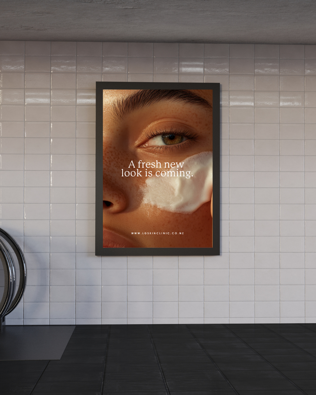
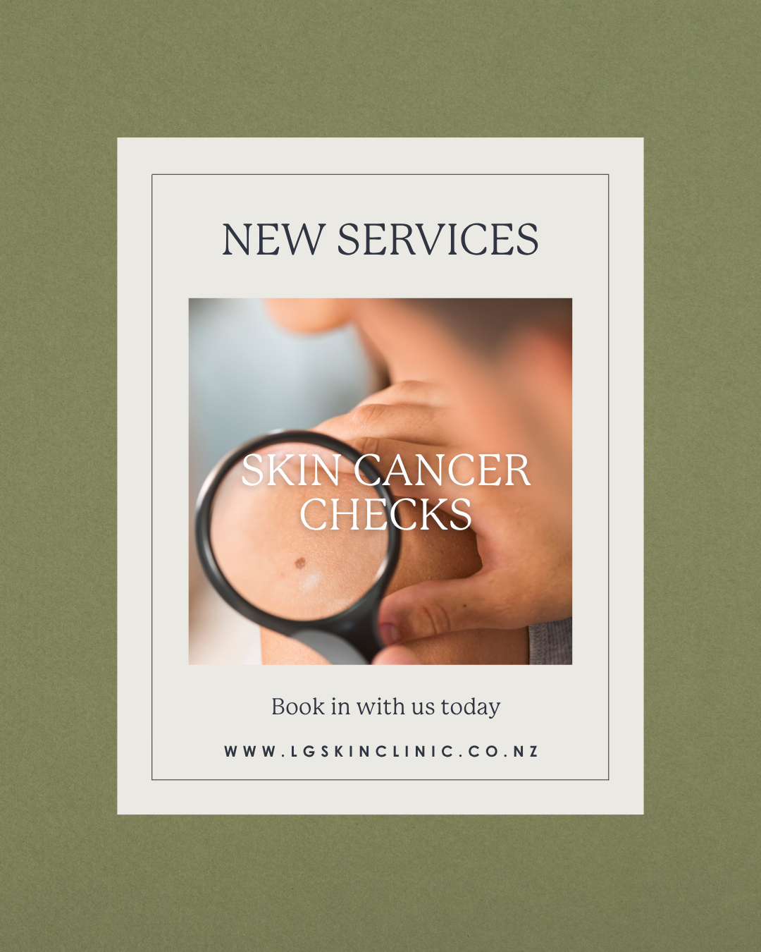
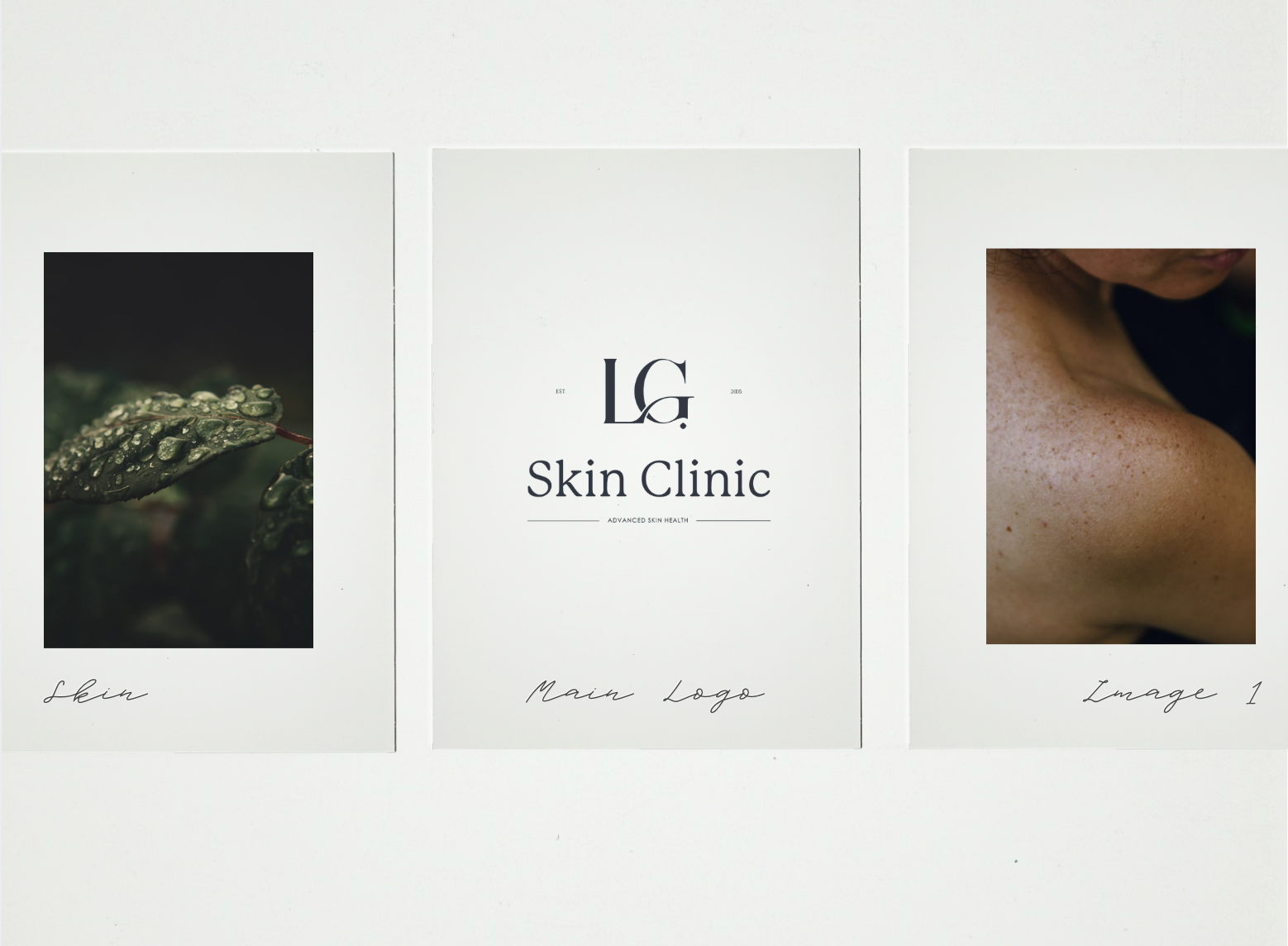
The direction for the rebrand was clear — keep things clean, simple, and elevated.
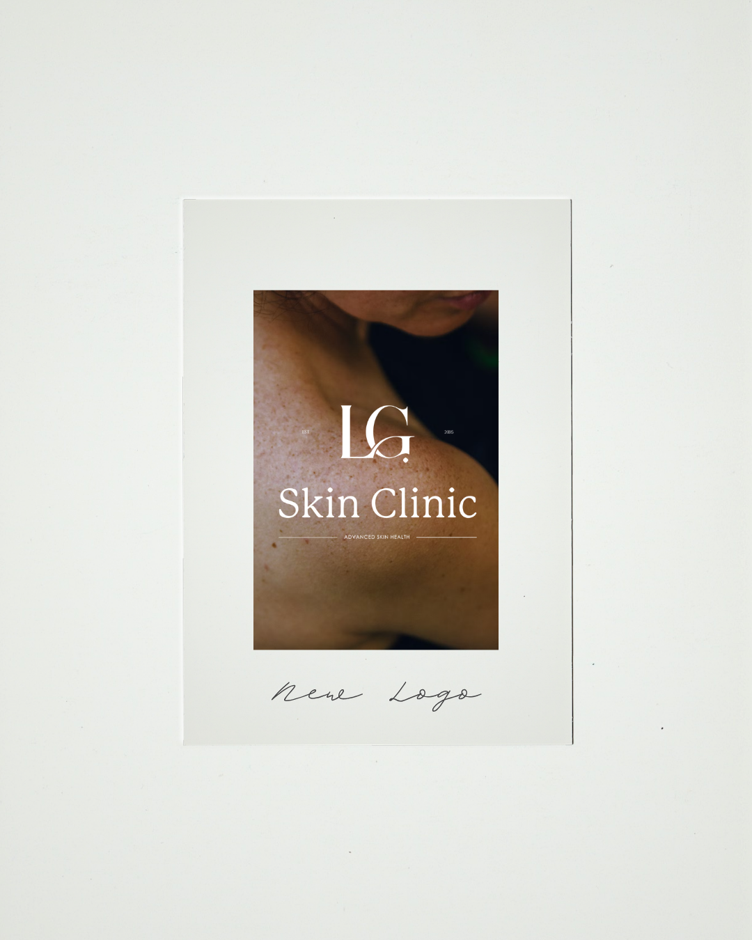
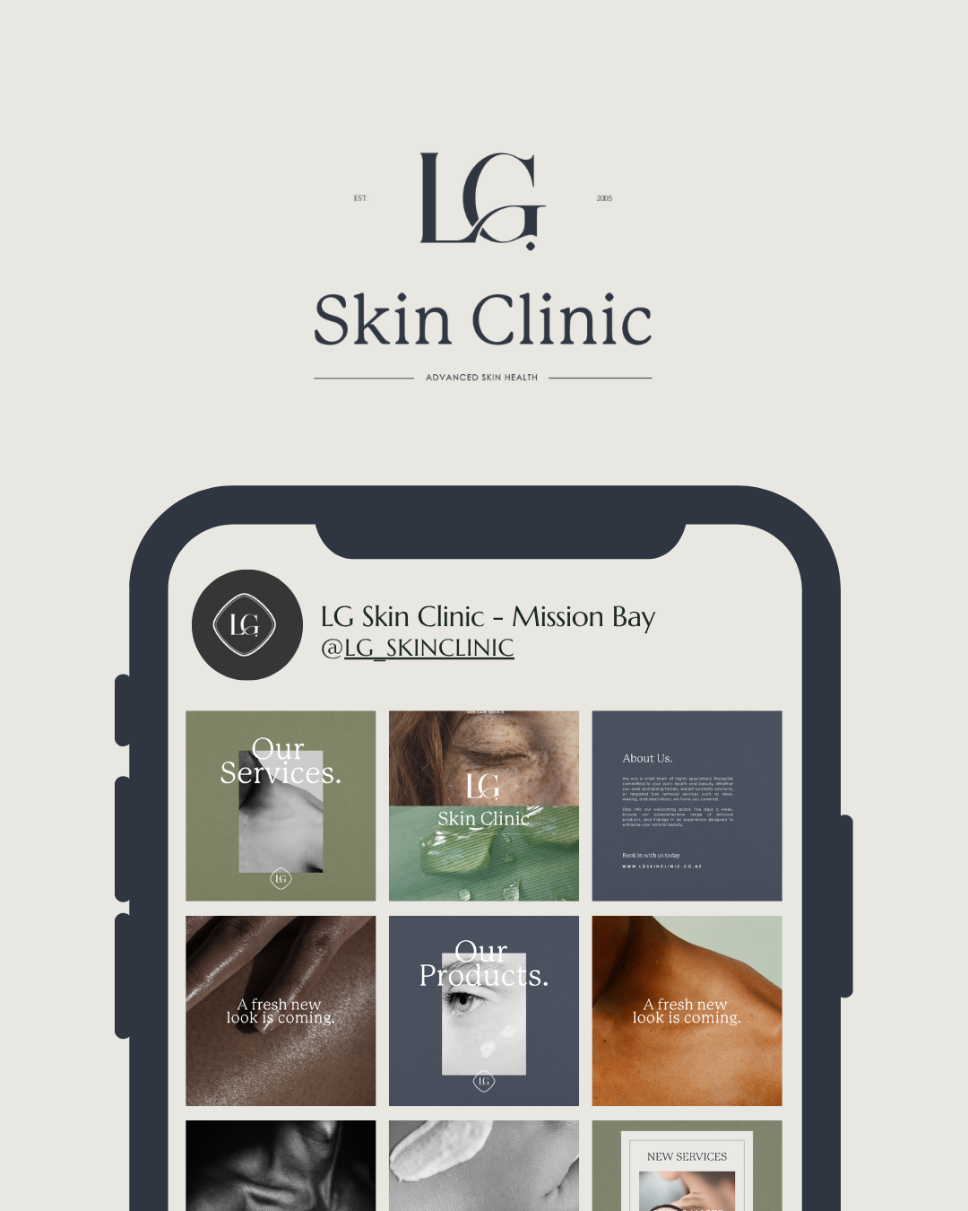
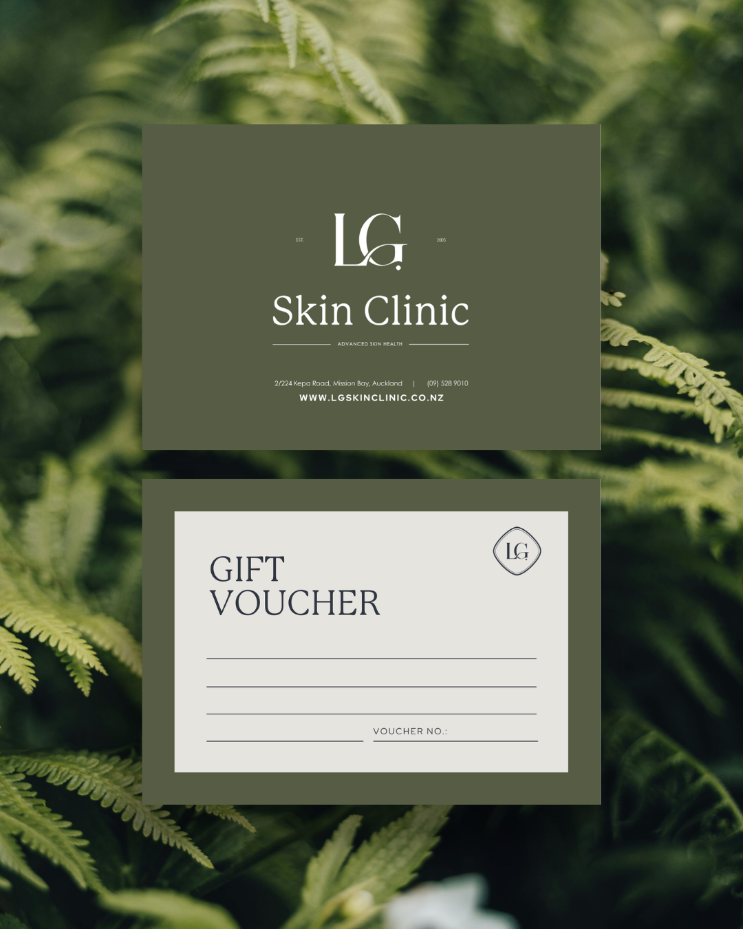
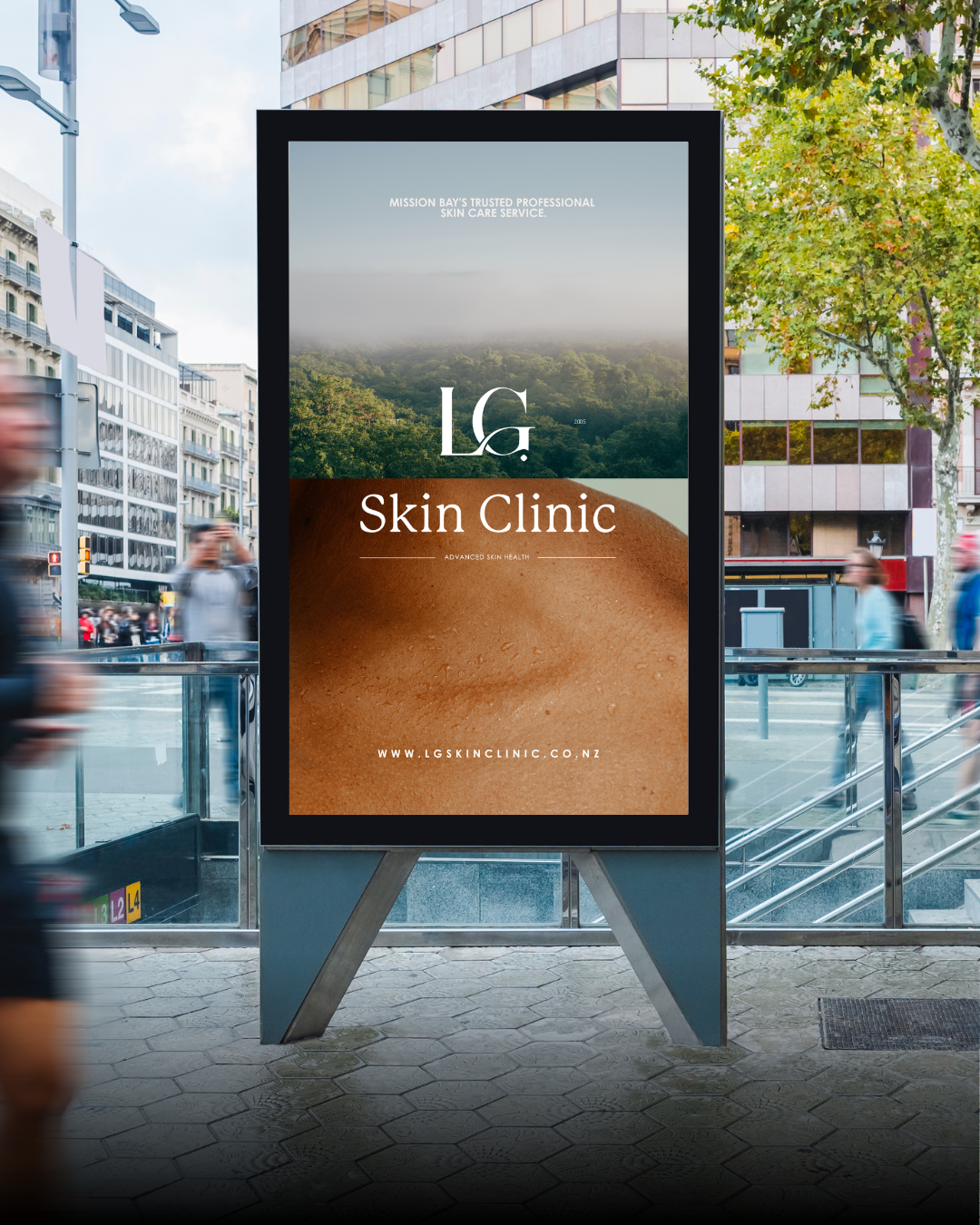
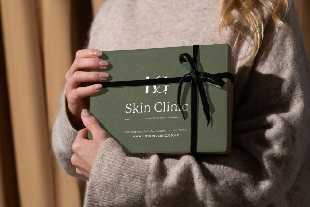
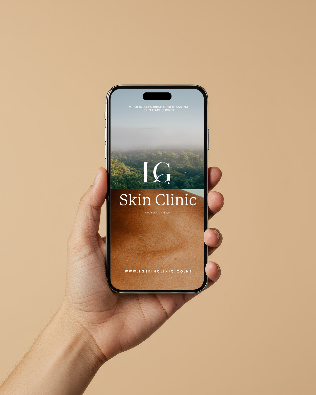
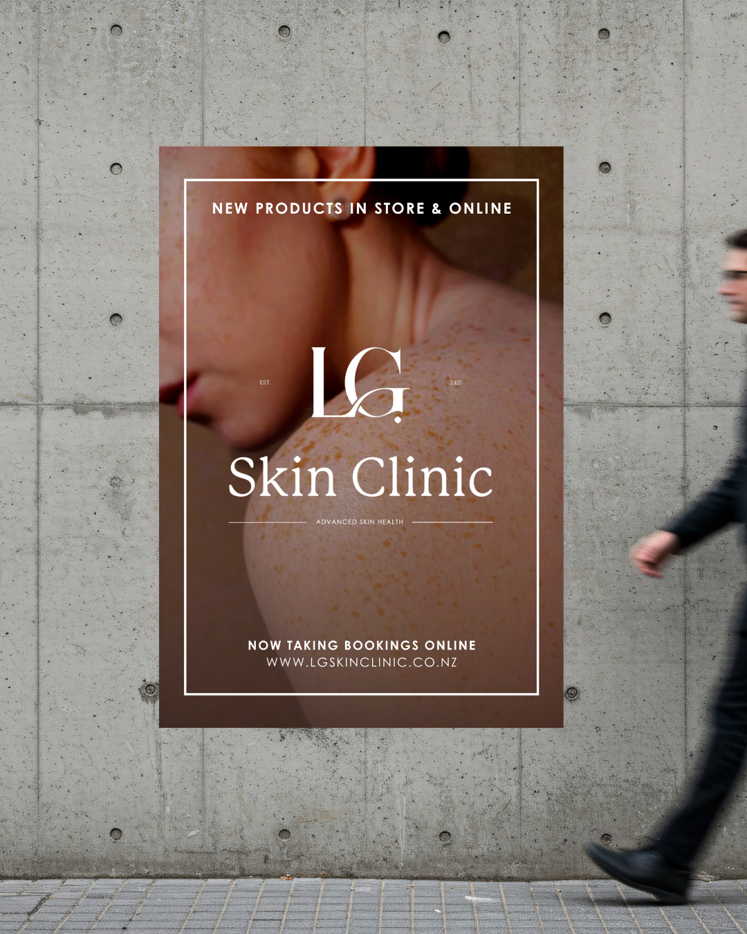
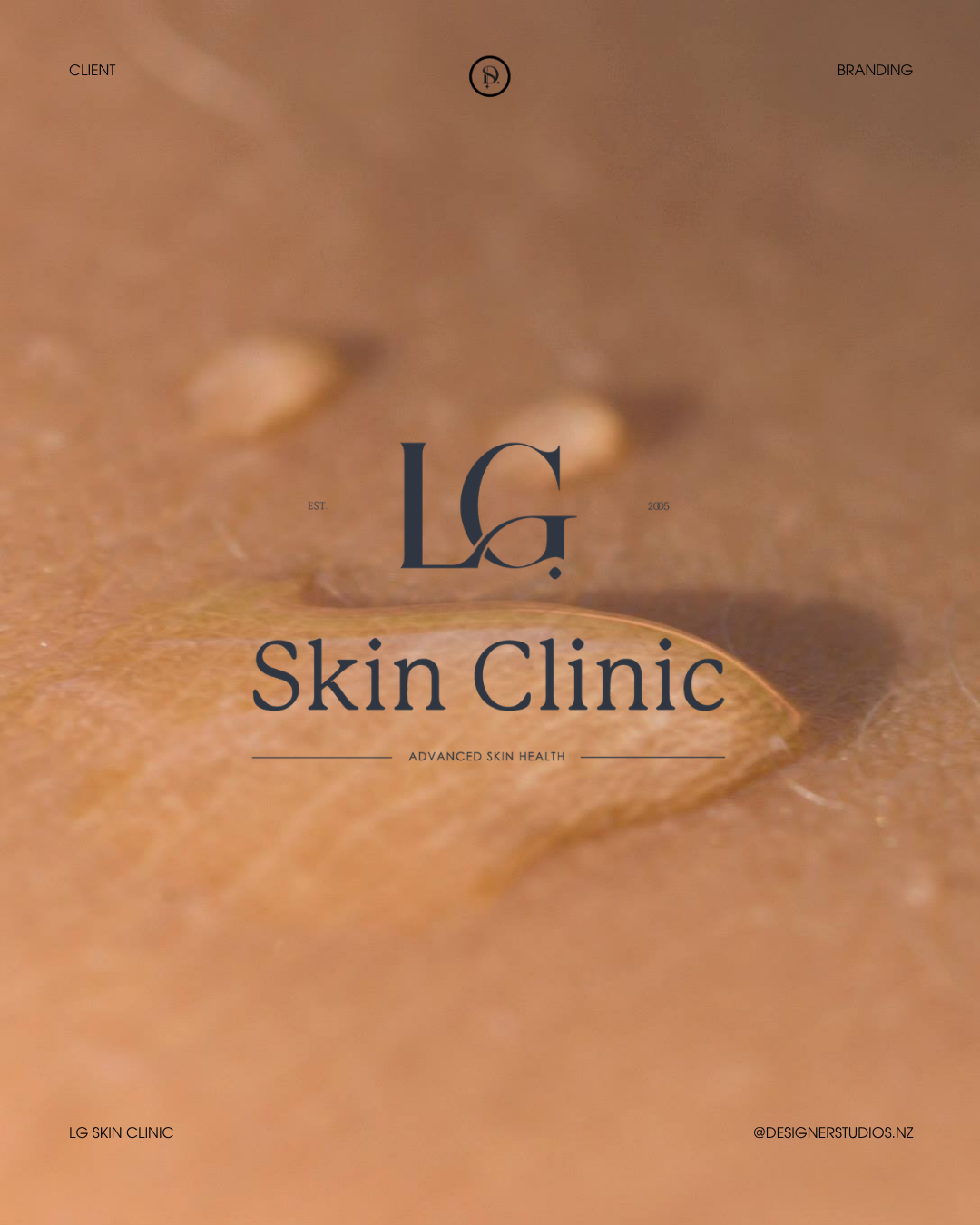
We focused on creating a logo that feels timeless and refined. Nothing overly complicated, nothing trend-driven — just something that would sit confidently now and continue to feel relevant years down the track. A logo that reflects the quiet confidence of the clinic itself.
Because when something is done well, it doesn’t need to shout.
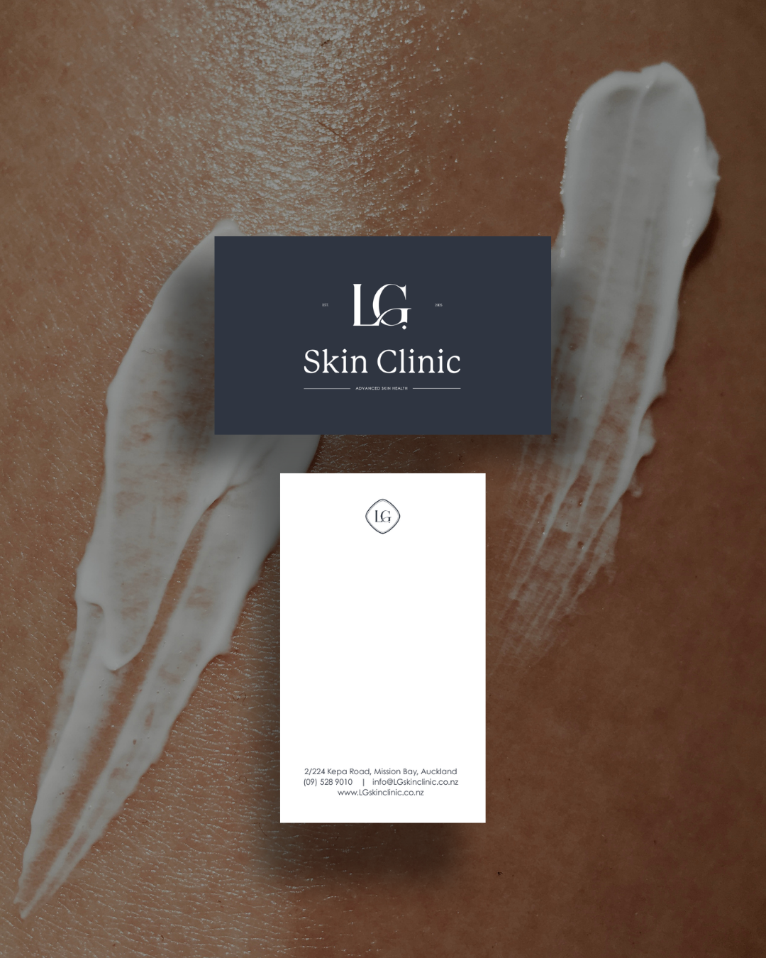
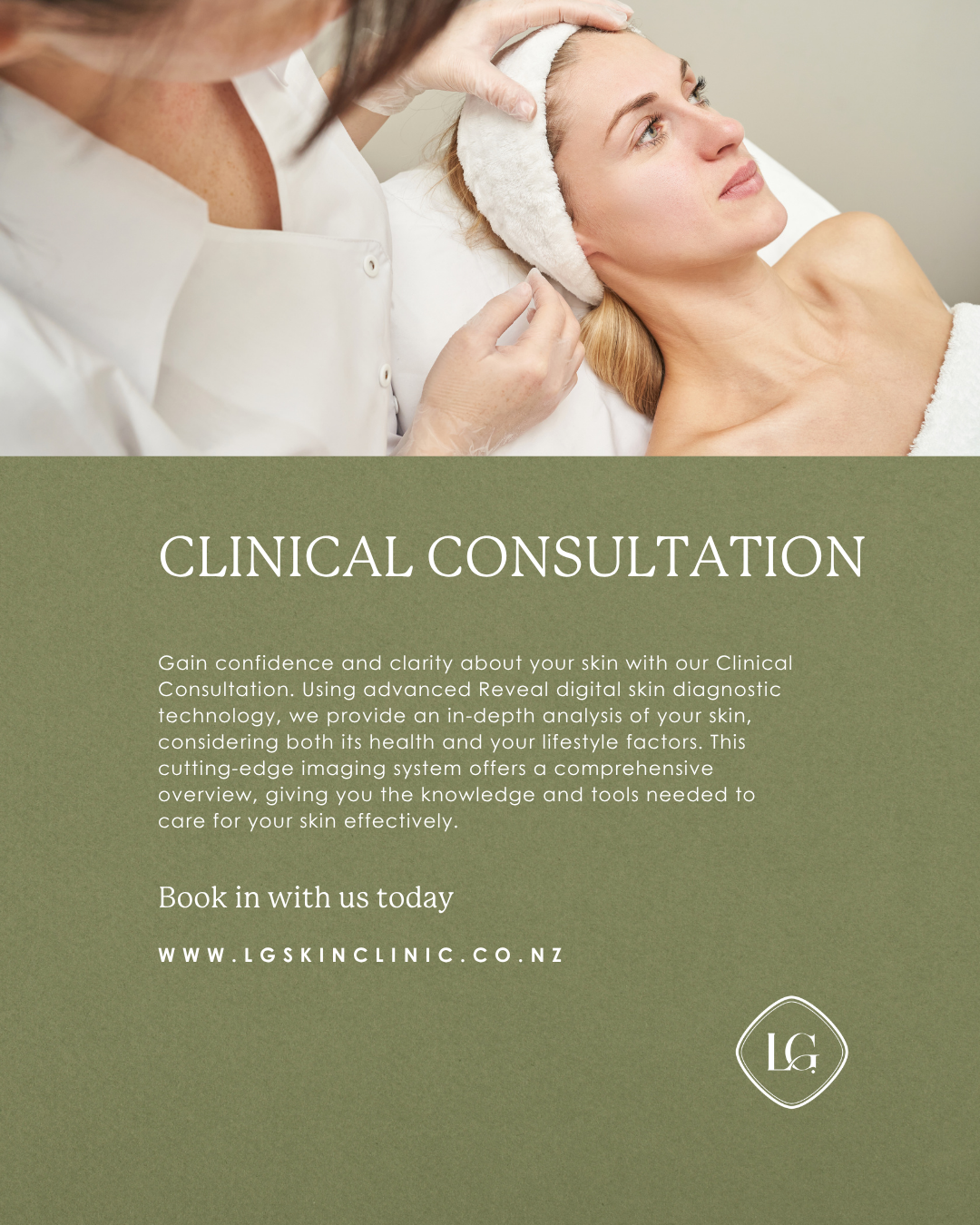
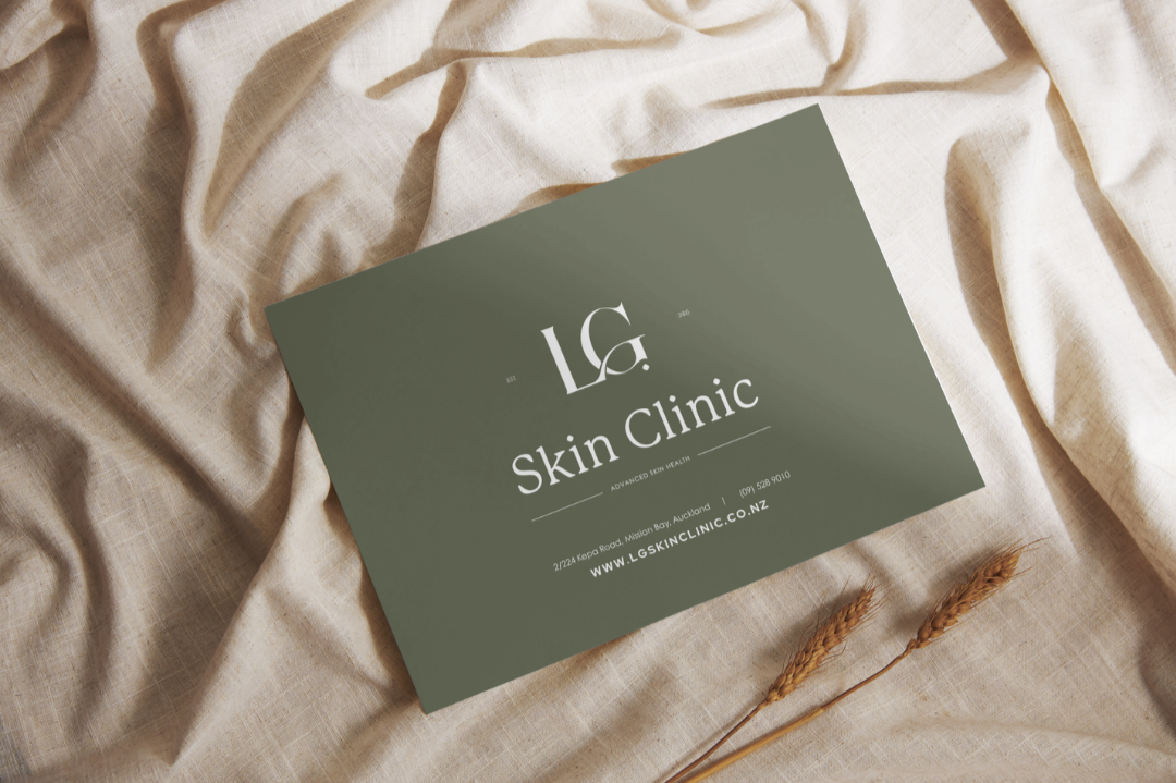
One of the most important parts of this project was the colour palette.
We wanted to create something that not only looked beautiful but felt aligned with the space, the team, and the experience of the brand.
The colours we landed on created a strong, grounded foundation — something the clinic and staff can genuinely connect with and carry through every touchpoint, from the space itself to their online presence.
That consistency is what builds trust. It’s what makes a brand feel considered, professional, and high-end.
Working with Kelly was an absolute pleasure.
She trusted the process, brought thoughtful insight, and was open to refining and evolving the brand in a way that stayed true to her vision.
Those are always the best projects — when there’s a shared understanding of where we’re going and a genuine collaboration to get there.
The result is a brand that feels calm, confident, and elevated.
A visual identity that reflects the quality of the clinic and the experience it offers.
And a foundation that will continue to support LG Skin Clinic as it grows.
Projects like this are a reminder that a rebrand doesn’t always need to be loud or dramatic — sometimes the most powerful shifts come from refinement, clarity, and intention.
And this one was exactly that.
https://www.lgskinclinic.co.nz/
—
Caitlin
Designer Studios